Wednesday, 29 March 2017

Makeup, Hair and Styling for Final Scene (First Look)

After discussing the importance of keeping the styling and makeup/hair simplistic so all the attention is on the movement and emotion, I decided to give all three models effortless makeup and hair with neutral, everyday styling outfits. I unfortunately did not get full images of the models in their first look so I have used screenshots from the behind the scenes footage. This is something I need to make sure I do in my future shoots so I am able to reflect on them. 

First Look (Wearable/Subtle)

Makeup


I kept the face makeup natural but perfecting on all models, with a dewy finish for a youthful and subtle look. I used mostly cream products to ensure the makeup didn't look too heavy; however I set the conceal so it didn't fade or crease and any areas where the dewy glow was unflattering, e.g. around the nose. I concentrated on highlighting the skin to give them face definition and to add an ethereal touch; I therefore gave the models a subtle contour. I left She's eyes bare, with no mascara, for an innocent and youthful look; however I added mascara to the society members to give them a more severe and slightly intimidating look. The makeup was quick to do, giving me enough time to do all three models in a short time frame, allowing me more time to teach them the choreography. I was concerned the models may be washed out on camera but this was not the case and it enhanced the models' natural beauty. The application on all models went smoothly and I had enough brushes not to use the same ones on the different models for hygiene purposes. 


Hair


I gave all the models relaxed and wearable hairstyles that would be relatable to the viewers. I gave She a loose ponytail and kept the other models hair down for an effortless look. I didn't want the hair too dominating as the whole styling of this first look was minimalistic and wearable. All the models had different styles and hair colours, giving them some individuality and keeping them from looking too staged and obviously styled. I worked with the models' natural hair consistency to decide which hairstyle would be most appropriate.  


Styling
She
Dancer/Society Member 1
Society Member 2
The styling was kept very neutral and minimalistic, focusing on beige, stone and khaki tones. I gave She a t-shirt dress, society member 1 a leotard and oversized cropped jumper and society member 2 loose trousers and relaxed strappy top because even though I wanted them to all wear the same neutral tones, I still wanted them to have a variety of styles to ensure they didn't look too staged. I wanted them all to look relaxed and comfortable, but I didn't choose anything too baggy because I still wanted their subtle movements to be visible. The material of She's t-shirt dress hung beautifully when she moved and worked perfectly for the first clip of her lying on the floor with all the hands touching her because the light material was easily moveable and fell back into place when the hands let go to flatter the body's silhouette. I kept the outfits age appropriate for a realistic look, as I think putting the older model in a leotard would have looked too out of place and inappropriate. The styling fit the models well; however I had similar back up options if this was not the case.

I think the makeup, hair and styling worked in unison to create a variety of wearable looks that were appropriate for each model and not too dominating, so the main focus was on the movement and emotion.

Planning the Logistics for Shoots 2 and 3

I had originally planned to shoot both remaining scenes on Sunday 2nd April; however the studios are not currently available on the weekends. After my meeting with Sharon, when she suggested using brighter lighting, I decided to use a grey backdrop so the shadows are more visible; however this means I would need to shoot in a studio rather than possibly using my studio at home. I messaged my team to find dates in the week they were free; however at such short notice they seemed pretty booked up. We had a few options in the next couple of weeks where everyone was available and I could book the studios; however Harrison was not able to book the correct filming equipment for any of these days. This panicked me because I had left about 3/4 weeks for me to edit the film together and finish my blog so moving the filming dates back would shorten this time. We decided on Monday 10th April and Thursday 13th April to shoot the scene are the equipment and team were available and it gave me time to book the studios.

I planned to do one shoot in my studio at home because I will only need a black background and I wouldn't need to transport the bed or find a free studio; however Harrison wanted to shoot the rest of the footage in a studio because the background will look cleaner and more professional so I needed to find two dates that would work, instead of one.

A problem with shooting the opening scene in a university studio is transporting the bed from my house to the studio. I organised with Lottie that I could store it in the makeup storing cupboard overnight the day before the shoot and I arranged with a friend to use their van for transportation. I can fit the table and chair in my car so will drive that to uni on the day.

I had to re-evaluate my production schedule because my shooting dates had been moved back two weeks and I needed to make sure I still had time to complete all my tasks. I therefore decided to get everything completed and organised for the shoot and then focus on completely my website, as this is a task I had left until the final weeks. I will also spend the next couple of weeks updates my blog with extra research and condensing the content to make it all relevant.

I was anxious that I wouldn't get everything finished in time, now that my production schedule had been moved around so I decided to postpone my two weeks work experience over Easter to the summer to give myself extra time.


Tuesday, 28 March 2017

Tutorial with Sebastiane (Film Imagery)

I showed Sebastiane my makeup, hair, styling, location and lighting ideas for the opening and second scene of my film to discuss whether my ideas would work collectively to portray my film's concept. I learnt from filming my dance scene the importance of time management and leaving enough time to make any changes suggested. We quickly discussed how happy I was with the filming of the dance scene and he said that something I needed to work on was creating an image that didn't need explanation, but that spoke to the audience on its own. This made sense as in my previous tutorials I felt I had to explain every detail so that it made sense, but I should be able to create something that makes sense without explanation.

First Scene Feedback
Makeup, Styling and Hair Designs

Sebastiane said the mesh styling did not make him think of bandages or tied rope, but instead ballet tutus which was alarming as this was supposed to represent her incarcerated state. After discussing the dance scene and how we agreed the more simplistic styling put more emphasis on the emotion of the scene, I suggested I made the styling more everyday and simple, for example a grey t-shirt or pajamas. However Sebastiane warned me that with the mouthpiece the styling may start to look like S&M, which is definitely something I want to avoid, especially as my target market are young adults because they will find this distracting and possibly comical. However Sebastiane did agreed that more wearable styling would be more relatable and make it look less staged. Sebastiane also suggested I tried the styling with and without the mouthpiece incase it looked too sexualised. I was concerned the hair design would look out of place with the more simplistic styling; however Sebastiane said he thought the contrast would work. I think the avant-garde hair, reflecting painful barbed wire, combined with the wearable, basic styling will bring the image into a fashion film context and creating an intriguing counterbalance.

Test Shoot Images
Sebastiane felt this scene, with the styling and location, was too overloaded and fussy. He said the broken bed had connotations of sexuality and hostage which don't reflect the film's concept, as I wanted the bed to reflect her asylum bed that she has subconciously admitted herself to. I now understand that I tried to incorporate too many dominant aspects to the scene, when more subtle props and styling will conjure up more genuine emotion. Sebastiane suggested either using an everyday looking bed or a chair to make it look more relatable. He said the shots looking at the model through the bed's bars were slightly cliche and obvious, whereas using more simple shots would give the impression of isolation. Sebastiane also suggested I incorporated some everyday items in the scene to make it look more relatable, but also because they will look slightly out of place in the black space. I don't want it to look like a genuine bedroom, but having those couple of belongings surrounding her will add an eery feeling of a home away from home, suggesting she has been placed somewhere and only been given a couple of her own possessions. I will experiment with the use of either a more normal looking bed or chair and the objects that will be around her. He said the lighting worked; however when I explained that I had chosen it to represent the cage she is trapped in, he said the reasoning was too obvious so he encouraged me to think less literally. He said the shadowed lighting spoke for itself in representing an uninviting space so I will continue to use this lighting effect.

Puberty by Edvard Munch
(Munch, 2011)
Sebastiane said the contorted positioning of the model did not make her look isolated, but instead had sexual connotations. I wanted the model to look uncomfortable and angular to reflect her feeling inhuman and like a distressed caged animal; however I think it looks too staged and unnatural. I also think the fact that she is laying down on the bed suggests she feels more comfortable than if she was awkwardly perched on the end. Sebastiane showed me the painting above of Puberty by Edvard Munch where a naked young girl is sat timidly and uncomfortably on the bed. If this girl was lying on the bed it would have communicated a different story; however her closed, stiff body language reflects how uncomfortable and unwelcome she feels. I want my scene to reflect the same loneliness so I will position my model similarly, either on a chair or at one end of the bed.


Second Scene Feedback


Sebastiane thought the makeup and hair would work in portraying how she feels trapped by society and he liked the restricting styling; he said he did not like the skirt but that will be covered anyway as the model is sat down. Sharon said she thought I should do a more simplistic hair design and then edit in clips of the more dramatic hair design as she felt the hair would be too dominant and distract from the emotion. I will experiment with doing a more simplistic hairstyle on my model.


Sebastiane thought the location and props worked well in creating a relatable setting, as it could mirror an office or school desk; he particularly liked the clean stack of paper on the table. I made a haunting black silhouette for the societal figure; however Sebastiane was concerned that it wasn't obvious enough that it was a human figure. I explained that I thought it made the figure look intimidating and how it masked the human's identity as people in society are turning into clones and he understood that but he was still concerned that it didn't look like a human figure. Sebastiane previously suggested using more simplistic styling that reflected a doctor or another authoritative uniform; however I was concerned this would specify the member of society that was being discriminative which I did not want to do as the figure was supposed to represent society as a whole. I told Sebastiane my concern; however he didn't think it was an issue and thought it was more intimidating if the viewer could see the societal figure's expression. I will experiment with making the black styling look more like a human silhouette and look for authoritative styling for the human figure so I can decide which will be most appropriate. 

I found this meeting extremely helpful and look forward to making the improvements. I am glad that I have time to make the changes with thought and consideration as opposed to feeling more rushed when making changes to the dance scene. 


References:
MUNCH, E., 2011. Puberty, 1894 by Edvard Munch [viewed 28th March 2017]. Available from: http://www.edvardmunch.org/puberty.jsp

Starting to Build my Website

I went to all the IT sessions with John so I was excited to start making my website with all my notes I had taken; however it became frustrating when I wanted to do something specific that we had not gone over in class as it slowed me down. However instead of getting annoyed about it, I wrote down all my questions so I could ask John in my next class with him, and moved on to something else. I found this method worked well and made sure I didn't waste time if I couldn't work something out. If I was stuck on a specific aspect I found YouTube very useful as there were clear instructions on what to do.

Building my website highlighted the importance of getting good quality behind the scenes and film related imagery because the quality of the images were vital in giving a professional looking website. In my first film shoot I was disappointed that I didn't focus more on the behind the scene images as they would have been useful for the website imagery; however I may have video footage I could incorporate onto a page banner. I could put these videos on repeat on the pages for a more animated look.

Screenshot from website (Memphis Zoo, 2017).
I was inspired by Memphis Zoo's website above to not only have silent clips of my film playing when you click on the website, but to have the film play on the background of the whole homepage, even when the viewer scrolls down. The faded coloured boxes on top break down the silent video to make the content added on top stand out and easy to read. They used bright colours for some of their boxes; however I don't think that will go with Ostracised's dark, neutral theme. I am excited to experiment with this and how I want to display my content on top. I am currently unsure how to do this so I will look it up on YouTube or ask John, my IT technician, for guidance.

Written Website Content

'About Me' Page

I wanted to add this page because I enjoy reading them on other artist and portfolio websites and I think it helps the audience to get to know me on a more personal level to hopefully encourage them to support my site. I gave a brief background of myself, including education and my passions, and explained why I wanted to make Ostracised. I also provided a slideshow of some of my previous work that I'm proud of to promote myself as a makeup artist and creative director. I researched other people's biographies on their website and there is a mix of first and third person; however I want to use first person, as I think it is more personal and chatty.

'Objectives' Page

In this page I wanted to explain exactly what Ostracised was, why I chose to make it and its aims and objectives. I think it's important to include the reasoning behind the project to bring to the viewers' attention the importance of the film. I wanted this page to sound more formal than the About Me page because discrimination is a serious problem that needs to be tackled with professionalism and understanding and I wanted my viewers to understand my genuine concern and want to improve it. I found a lot of inspiration from my project proposal, as it explained in detail my project's concept; however I didn't want this page to be too long on my website so I needed to condense the information and possible lay it out in bullet points so the viewer doesn't lose interest and it's easy to follow and understand.

'Sophie Lancaster Foundation' Page

I wanted to include the foundation's background so that people visiting the website understood her story. I also wanted direct links to The Sophie Lancaster Foundation's page and a link to a donation page to show my support for the foundation and so people could find out more information if they required it. I also included direct links to some of the merchandise the charity offers to make it as easy for people to donate and buy merchandise as possible, to hopefully encourage their engagement. I bought some SOPHIE wristbands for all my team to wear and so wanted to include an image of the Ostracised team showing their support to the foundation and to hopefully encourage people to purchase the bands.

I thought adding an interview with Sylvia Lancaster would add a personal touch to the website and show that I have engaged with the charity's founder. I wanted to understand her view on current educational resources available as I am hoping to add my film, Ostracised, to resources available so wanted to ensure it was relevant and would be effective. I feel so lucky to have had the opportunity to interview Sylvia Lancaster as I have a lot of respect for the work she has done in creating a legacy for her daughter and in supporting alternative subcultures.

'Education' Page

I wanted to include a page dedicated to education because I wanted to highlight the lack of educational resources tackling bullying and discrimination for colleges and universities and how crucial these are in creating a tolerant society. I wanted to explain that Ostracised will be used as a teaching resource for higher education and that I hope to the colleges and universities that show the film with aim to spread the awareness of discrimination and hate crime. Even though there is not much content on this page, I still wanted to create a separate page to highlight its importance.


I will continue to work on building my website's design and content to achieve a professional and appropriate website to complement and support my educational fashion film, Ostracised.


References:
MEMPHIS ZOO, 2017. MEMPHIS ZOO [viewed 28th March 2017]. Available from: http://www.memphiszoo.org/

Monday, 27 March 2017

Scene 2 - She's Second Look

I spoke with Sharon and we decided to include a more minimalistic look to balance out the more complex one of the caged hairstyle and restrictive dress. After looking at the storyboard I created for this scene I thought the plain black strappy top I used worked well in portraying an everyday outfit that mirrored the other more dramatic black outfit. For the hair design, I wanted to continue with the use of plaits to represent her feeling trapped; however I wanted a more simplistic version so I did further research into my possibilities.

(Marie Claire, 2017).
I found an article in Marie Claire stating that plaits are back and on trend in Spring 2017. This confirmed my intention to incorporate plaits into the hair design. The article included many celebrities wearing plaits; however I particularly like the image above of Beyonce because it was so tight and restricting. I want to develop this design further as I think it is too wearable and I want the hair to mirror my more elaborate design more closely with multiple plaits used. 

(gettyimages, 2013).

The Sava Nald show at AW13 Fashion Week inspired me to wrap the plaits round the model's neck. The model in this image looks relaxed as the singular plait is loosely draped round her neck; however to create the restrictive and intimidating feel of my design I want there to be multiple plaits tightly wrapped around her neck to reflect her suffocating emotions as a result of society's enforced opinions. 

Quick Practice


I bought more of the hair extensions I was using in the more dramatic hair design as my model's hair was not long enough for my desired look and I wanted to be able to style the plaits before, to then simply attach them to her hair before shooting. In this practice I simply attached the plaits with hair grips to a low ponytail and had her hold the ends to get an indication of the effect. I decided to mirror the other design by creating french plaits running away from her face as if they were attached to the plaits round her neck, in contrast to the french plaits in the dramatic design running towards her face, but still giving a similar overall look. 

I will use the same makeup for both looks as the makeup will be more dominant in this design, as it is more visible than through the caged hair, and I want a direct link between the two looks to show they are just different variations of the same emotion.

I will film all the scenes with the model in the more complex styling and then only film selected clips with this simplistic version. I will pair this simplistic version with the society's black phantom figure styling to ensure the more dramatic looks of each character are balanced with the other's more simplistic look. I intend to insert these clips sporadically to only reveal a few disturbing glimpses of the more intimidating silhouette.


References:
MARIE CLAIRE, 2017. Plaits are back people. Get inspired... [viewed 27th March 2017]. Available from: http://www.marieclaire.co.uk/beauty/hair/plait-hairstyles-162613

GETTYIMAGES, 2013. Sava Nald Show - Mercedes-Benz Fashion Week Autimn/Winter 2013/14 [viewed 27th March 2017]. Available from:  http://www.gettyimages.co.uk/event/sava-nald-show-mercedes-benz-fashion-week-autumn-winter-2013-14-159720090#
model-walks-the-runway-at-sava-nald-autumnwinter-201314-fashion-show-picture-id159609897

Sunday, 26 March 2017

Shoot 1 Reflection


I was extremely anxious for this shoot because I had only finalised some of my styling the night before and still hadn't decided how the scene was going to end to fade into the final image of She. I was also nervous because we only had until 12pm to shoot everything as Natalie (model 1) had to leave then. I had set as much up as possible the night before so I could start straight away in the morning so I knew where everything was. I was relieved when everyone turned up on time as there were no delays.

The first hair and makeup looks on the models were very simplistic so I could do each model in just under 30 minutes, meaning we could start filming as soon as 8am. Up until two days ago I was only going to use two models so I felt slightly rushed having to fit another model's hair and makeup in, but I managed to use the time efficiently and teach the other two the choreography whilst doing her makeup and hair.

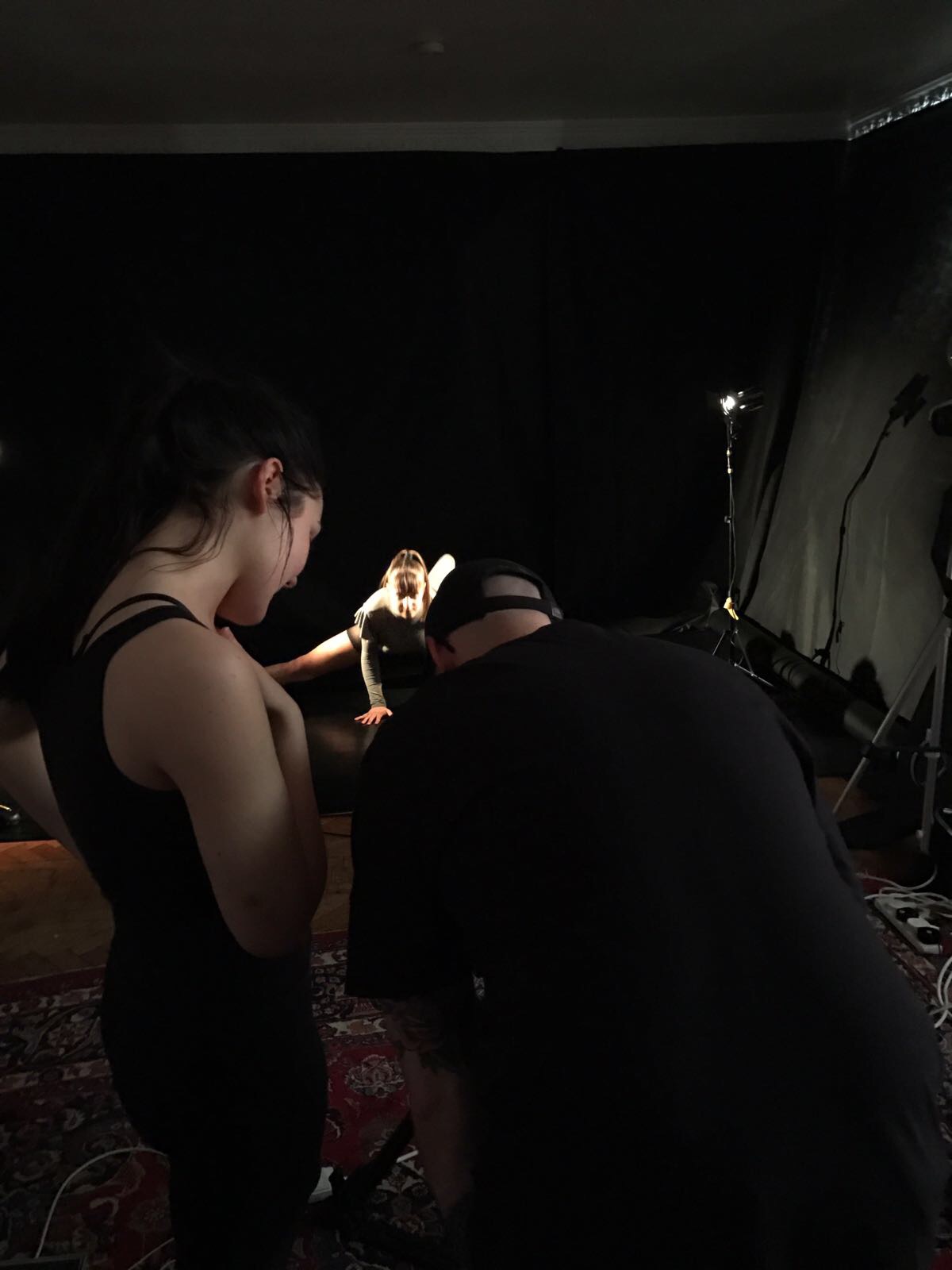
I did not realise how long it took to set the lights up for each shot because when I did the test shoot I only used one light and just moved it quickly to take the next shot; whereas we needed to use two lights to fill in the harsh shadows so no detail was lost. This meant that even though I was clear on every shot it still took longer than I had hoped, giving me less time than planned to do the models' makeup and hair for the second part. When I plan my next shoot I will allow extra time for the lights to be set up and then even more time to allow for any delays. Even though I found shooting stressful towards the end, I still did not let it distract me from achieving the shots I wanted from many different angles.

Looking back, I should have printed out the storyboard instead of having it on my laptop to make it easier for everyone to see instead of constantly having to move to see my laptop. I was also playing the music from my laptop so it was not ideal to keep having to find the storyboard. I will print out multiple copies of the storyboard in my next shoots to make sure everyone is clear about what they are doing.

My models and dancer took instruction effectively, with no complaining or confusion, allowing me to teach the choreography at a fast pace and correct their movement to be synchronised. I worked efficiently with my cameraman and lighting technician to create the correct lighting set up, angles and closeups for each clip at a steady pace. I was clear with what I wanted in each scene so he could set up the equipment whilst I instructed the models.

The biggest regret was not taking photos of every makeup, hair and styling look for each model. I was in such a panic trying to complete each models' makeup to a high standard that I ran out of time to photograph them and the photos I did take of the makeup and styling did not have realistic lighting, making the models look washed out. I was disappointed that I couldn't capture each look because I was proud of the work I had achieved but felt I didn't have closeup images to showcase this. This emphasised to me that I always need to allow more time than I think for every aspect of the shoot; I will do this for my next shoots. I will be shooting the other scenes in the university studios so I will set up an extra soft box and camera and take the photos against the surrounding black curtains.

I ran out of time at the end of the shoot to film the final clip with Natalie in her white leather blazer; however I can shoot that on another day. My priority was to get all the scenes filmed with Louise in as she won't be available after this, whereas Natalie will. After Natalie had left we shot some beautiful clips of Louise doing some jumps and tricks as I am hoping to integrate them with the faster dance sections to add power and strength.

Doing this shoot made me reconsider doing the other two scenes in one day because the lighting took longer than expected and I want plenty of time to do the model's makeup and hair, and take photos of everything. I will therefore film the second scene with the model scribbling her nightmares on one day and then the opening scene and the final clip I didn't have time to film today on the second day. I think it would be unrealistic to film it all in one day, especially as I am now doing three hair and makeup looks. I would prefer to take my time to get the filming and styling to a high quality, rather than rushing.

After looking at the behind the scenes footage, I felt that if I continued to create similar footage for my next two shoots, the end result would be extremely tedious and monotonous for the viewers to watch; I therefore felt images would be a more effective and quick way to translate the behind the scenes action for my film. I also needed images to include in my website and Instagram, so it was essential I had professional and high quality images of my film's production. I will therefore not continue to capture the footage on film, but instead through imagery.

Saturday, 25 March 2017

Ostracised's Competitors

When researching competitors I discovered a number of films concerning the effects of discrimination, but found the majority were of a similar format and therefore were unable to create any unique meaningful impact on their audience.  In most cases victims describe their experiences by speaking directly to a camera and, though very heart wrenching, I felt that one story almost merged with the next and did not have any lasting effect.  This confirmed to me my initial idea of wanting to create something more unique and thought provoking.

There are various educational resources available addressing the issue of discrimination and schools teach children about diversity and tolerance as part of the curriculum. Ostracised will be aimed at a slightly older audience, 16-22, and will encourage viewers to question their own views and behaviour.


The Harms of Hate, by the University of Leicester, in Association with the Leicester Hate Crime Project
(University Of Leicester, 2014).


Screenshot from Film.
(UniversityLeicester, 2014).

This film was released by the University in February 2014 to highlight the effects of hate crimes by telling the story of seven different victims of a range of prejudices, including religion, race, mental and physical disability and simply the way a person chooses to dress.  The film takes the format of the seven people speaking directly to the camera explaining what happened and the effect it had on them, sometimes physically and sometimes psychologically, with one victim being driven to attempt suicide.  The film was 14 minutes, which I felt was too long, as having one person speak after another became monotonous with no variation to the format and nothing to challenge the audience to think for themselves. This confirmed my intention to make a short film of approximately 5 minutes, to keep the audience's attention and to try to challenge them by creating a film which needed interpretation.

The film ended with details of a number of charities to contact for support. This inspired me to include details of my website at the end of my film, as my website has information and direct links to relevant organisations which can offer support. However, I decided not to include these charity details at the end of my film, as I aim to bring particular attention to the work of The Sophie Lancaster Foundation, which I will be mentioning at the end of my film, and do not want to detract from the work of this particular charity.


Dark Angel, The Sophie Lancaster Foundation in Association with Illamasqua
(SophieFoundation, 2009).

Screenshot from Dark Angel Film.
(SophieFoundation, 2009).

The short film Dark Angel, by renowned French director Fursy Teyssier, was commissioned by Illamasqua in support of The Sophie Lancaster Foundation and released on YouTube in November 2009 to mark what would have been Sophie Lancaster's 23rd birthday. It tells the story of Sophie, who was attacked and killed in 2007 simply for the way she looked and dressed; as a member of the Goth culture. Her mother, Sylvia, subsequently set up the foundation to create a lasting legacy to Sophie, to create educational resources to encourage people to be tolerant of alternative subcultures and to campaign for prejudice against them to be covered by UK Hate Crime legislation. (ILLAMASQUA, 2017)

Dark Angel is a short animated film of just 3 minutes 50 seconds. In discussions with Sylvia Lancaster, she explained to me that it was created specifically to increase empathy levels amongst young people, as research had shown this age group lacked empathy, and that in her experience of showing the film in colleges and schools it had helped audiences achieve a better understanding of the emotional torment suffered by victims of discrimination. I found the film very emotional and liked that it was short, made a statement and then left me thinking about Sophie, what she had suffered and why. The film put its anti-discrimination message across in a different way, without a victim speaking directly to camera, and it asked its audience to empathise with the victims; both of which are points I aim to include in my film as I think they made the film more memorable. 

I noticed that the film's acknowledgements and credits began a full minute before the end of the film, which I felt was too long, especially for such a short film, as it lost my attention and so I stopped reading. Additionally they followed a written message from Sylvia Lancaster in support of the foundation, which I did find touching; however it added to the bulk of writing which, towards the end, lost my interest. I will try to keep the credits short and concise; however I do like the idea of a short message or slogan at the end of the film to give the audience a final message for them to contemplate and I intend to include The Sophie Lancaster Foundation's 'Stamp Out Prejudice, Hatred and Intolerance Everywhere" at the end of my film. Additionally, the film is mentioned under Aims on the foundation's website but I did not find any direct link to it on the site. This has confirmed to me the importance of creating easy to use links to relevant information on my own site as I found it frustrating that I couldn't find the film quickly. 


Untitled by Nick Knight, in collaboration with Naomi Campbell
(SHOWStudio, 2008).


Screenshot of Untitled Film.
(Knight, 2008).

Untitled is a political fashion film addressing the problem of lack of diversity in the UK fashion industry where racism is apparently accepted, with the vast majority of fashion models still being white despite the UK's increasingly multi racial society (SHOWStudio, 2008). The film uses quotes from Nick Knight to express his disgust at racism in the industry and how it must make non-white models feel. The film is silent, allowing the stark statements on his own personal experience of being dissuaded from employing black models and how this has made him feel, speak for themselves. Interspersed with pictures of Naomi Campbell pointing two automatic rifles towards the camera, the film ends with her venting her anger and frustration at this discrimination by firing rounds indiscriminately, supported by a powerful cannon. The eerie silence of the film and necessity to read the quotes on the screen keep the viewers' attention, before they are shocked by the dramatic ending. In Ostracised the story will be told through abstract visuals, rather than by a written message, with avant-garde styling, makeup and editing needing to be interpreted by the audience to understand the anti-discrimination message. I found the silence effective in creating emotion and will use this in parts of my film, combined with recorded sound effects to create atmosphere and reflect She's changing emotions.


TES.com Teachers TV : Homophobia
(Teachers TV, 2013).


Screenshot from Teachers TV (2013).

The TES website is a resource for teachers providing advice on job opportunities, updates on developments in teaching and a range of teaching resources, including a series of videos designed to encourage discussion on a number of subjects covered by PSHE lessons, such as discrimination and bullying (Teachers TV, 2013). This video focuses on a boy bullied for his sexuality and is aimed at 11-16 year olds. It is predominantly the victim speaking to camera about his experiences, how it affected him emotionally, how he dealt with the situation and his advice to other victims of bullying. The film is short and keep's the viewer's attention, encouraging sympathy for the victim's distressing situation, but I felt I was being talked at and just absorbing information rather than being encouraged to question the bullies' behaviour and the trauma they created. If this video is used in a class situation, it can be used as a starting point with a teacher encouraging the pupils to ask questions and delve more deeply into the subject after watching the film. However, with Ostracised I intend to create a film which forces its audience to ask questions right from the beginning in order to interpret the film, its setting and its underlying meaning, so that it can stand alone as a thought-provoking film and leave its audience wondering about She's own particular circumstances, interpreting them as it is most relevant to themselves and so empathising with her situation.


I found looking at some of Ostracised's competitors' work extremely insightful in making sure the film was unique and innovative in its educational approach and final outcome. It also helped me to develop my film further by inspiring me to include certain aspects, like a short credits list and the use of silence, to improve my film and make sure I was producing a film with the positive aspects of its competitors as well as its own individual elements. 


References:
UNIVERSITY OF LEICESTER, 2014. New video exposes the harm of hate crime [viewed 25th March 2017]. Available from: http://www2.le.ac.uk/offices/press/press-releases/2014/february/new-video-exposes-the-harms-of-hate-crime

UNIVERSITYLEICESTER, 2014. The Harms of Hate [viewed 25th March 2017]. Available from: https://www.youtube.com/watch?v=MCFJd2U2BNQ

SOPHIEFOUNDATION, 2009. darkangel_sophie_lancaster_foundation.mov [viewed 25th March 2017]. Available from: https://www.youtube.com/watch?v=qW2ve6_BkRA

ILLAMASQUA, 2017. S.O.P.H.I.E [viewed 25th March 2017]. Available from: http://www.illamasqua.com/s-o-p-h-i-e/

SHOWSTUDIO, 2008. 'Untitled' by Nick Knight [viewed 25th March 2017]. Available: http://showstudio.com/blog/post/untitled_by_nick_knight

KNIGHT, N., 2008. 'Untitled' [viewed 25th March 2017]. Available from: http://showstudio.com/project/political_fashion/films/undefined

TEACHERSTV, 2013. Teachers TV: Homophobia [viewed 25th march 2017]. Available from: