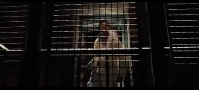
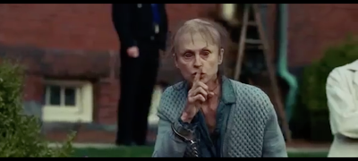
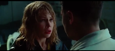
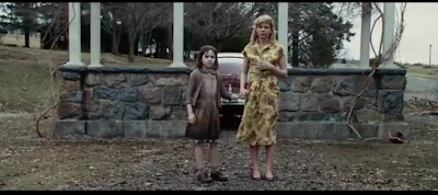
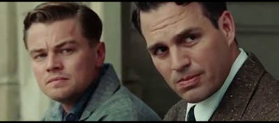
Shutter Island is a thriller/drama, directed by Martin Scorsese. It follows a marshal, Teddy, who has been called to an island because a dangerous mental patient has escape the premises without a trace. However all is not as it seems as the story progresses. I decided to review and analyse this film because it mixes fear with drama, making it an almost detective film, which is different from the horrors I have reviewed before.
Music/Sound
When the viewer is introduced to Shutter Island, the music instantly puts the viewers on edge because it is very loud and powerful compared to the soft sound of the sea and wind before. The intimidating music has gaps of silence which I think creates tension as the viewer is not sure whether the music has stopped or whether there is going to be something unsuspected to fill that silence. I personally think the music is too dramatic when the two marshals are traveling to the mental asylum because it is so loud and over the top, almost as if it's a cartoon. I think the music should have been a lot quieter,with continued silences, like at the beginning, to create tension, instead of
 |
| Screenshot of Shutter Island (2010). |
There is a scene where the marshals are trying to look for Rachel or Laeddis who Teddy thinks may both be buried in an abandoned looking grave yard. There is a strong storm which acts as pathetic fallacy because it makes the situation they're in feel even more dramatic and scary. The high winds and crashing of branches are very loud, making them sound powerful and threatening; both men have to shout over the storm to be heard which I think is effective because it makes them seem more panicked and anxious. The lighting is dark which I like because nothing looks clear, meaning anything could be lurking in the background. The storm is so extreme that branches are getting ripped off trees and leaves are flying everywhere, almost like there is something supernatural going on.
 |
| Screenshot of Shutter Island (2010). |
Teddy starts to piece together all the random dreams he had been getting to reveal the truth of what happened at war. The music is very cutting and harsh, with constant beats that get louder and quicker as all the men are lined up along the wire, ready to be shot. The music builds to a crescendo which builds up the tension in the atmosphere and the viewer as you wonder whether all the guards are going to be shot. As the fear increases the pounding increases which could represent the heart beat pounding in fear as the adrenalin rises. As soon as the first gun shot goes the music stops completely, leaving only the sound of gun shots; I think this is effective because it emphasises how powerful and deadly the gun shots are. I think the silence is effective because it almost makes the viewer stop and think about the shocking reality of what is going on and it could be interpreted as representing how helpless the guards are. You can hear the guards screaming and shouting in the background highlighting how terrified they are and the pain they're in. After the gun shots finished and all the guards had been shot, they is a moment of silence which I think emphasises how horrific the shootings were and gives the viewer and Teddy and chance to stand back and look at the helpless dead bodies. This is one of my favourite scenes in the film because I think it really catches the emotion of the viewer.
 |
| Screenshot of Shutter Island (2010). |
When the two marshals are talking in an abandoned shed Chuck begins to piece things together that Rachel never existed and it was just a made up case to get them on the island. As his voice gets louder and the panic in his eyes increases the music reflects this by increasing in volume at the same rate and getting faster, making the scene sound more dramatic and tense. The build in music increases the tension and fear in the scene with it and when it hits the crescendo the doors on the shed suddenly fling open to let the powerful storm attack them, forcing them to take cover, possibly reflecting how they now feel trapped. There is a moment where the camera looks outside the bust open doors which builds tension as the viewer wonders what or who is out there and why the doors flung open to violently.
 |
| Screenshot of Shutter Island (2010). |
So much tension is build up when the marshals enter the first big room in Ward C because it is so quiet and eery, with only the sounds of distant screaming patients and ripping water. They slowly approach an open door at the end of the room, looking very hesitant, which instantly put me on edge as something or someone might be hiding behind it. The whole room is completely silent until suddenly a patient jumps out and shouting "tag! You're it!" which terrified me and made me jump because it was such a difference to the silence that had led up to it. This is definitely something I could do in my fashion film because it truly scared me and I want that type of emotion to come through to my viewers.
 |
| Screenshot of Shutter Island (2010). |
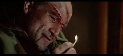
I found it terrifying when Teddy was left alone to search the dark ward because there were so many strange voices. It wasn't clear whether the voices were real or whether Teddy was imagining them which I liked because it created a lot of uncertainty and mystery. The voices were saying "Laeddis" which made me think they were imaginary voices because I thought it was too much of a coincidence that the voices weren't only saying his name. The voice sounded like a ghost because it was so faint and airy, making it sound super natural, like it wasn't real or human. Apart from the whispering voices it was completely silent, creating a lot of tension and suspense. Teddy used a lit match as the light source to navigate him round the corridor, but every time he lit the match it was so loud and sudden that it made me jump every time! I could use this technique of adding a loud, quick noise amongst silence to shock the viewer because it can add to the tension of the scene.
 |
| Screenshot of Shutter Island (2010). |
I noticed the music used in this scene was a recurring motif throughout the film, used when something back is going to happen. It is a continuous stabbing beat that starts off quiet to hint at the view that something bad is about to happen and then it continues and gets louder and more intense to build tension. This inspired me to possibly repeat a section of music in my fashion film to reflect a certain mood or as a sign something is going to happen. I think it's effective because the music ends up haunting the viewer as they know it always represent something terrifying is going to happen and so it instantly puts the viewer on edge, instantly creating tension.
Lighting
 |
| Screenshot of Shutter Island (2010). |
 |
| Screenshot of Shutter Island (2010). |
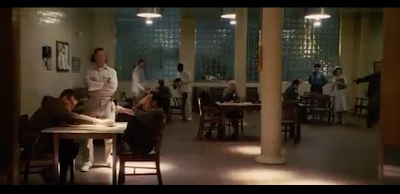
The lighting in the mental institution's common room was dark, with only patches of light coming from the ceiling. This contrasting lighting instantly gives the scene a mysterious feel because not everything or everyone is clearly visible, making you question who is lurking in the background. This lighting from above also casts harsh shadows on the marshals and doctor, as they discuss the missing patient, which makes their expressions look more dramatic and menacing.
 |
| Screenshot of Shutter Island (2010). |
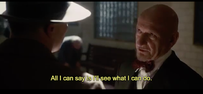
The scene shown above is when the marshals ask the doctors for the files of all the staff that work their to help their investigation but they refuse and so have a heated argument. When the marshals are driven away from the building there is heavy rain and high winds and it is clearly night time because it is so dark. This represents the classic use of pathetic fallacy, where the weather reflects the mood, because the awful weather reflects how angry the marshals are that they are being withheld information. This is the first time the audience get a hint that something is not right about the doctor, emphasised when the scene shows him as almost a silhouette standing outside his house, giving him an evil and mysterious look.
 |
| Screenshot of Shutter Island (2010). |
 |
| Screenshot of Shutter Island (2010). |
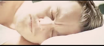
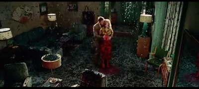
To show that Teddy is going into a dream, his face slowly becomes very bright and over exposed until he lands in a colourful, patterned setting which seems to be his old flat. He dreams about his dead girlfriend who initially seems very caring and sweet, but quickly turns when she says, "She's still here Teddy.. ..She never left" which Teddy interprets is about Rachel, the girl who escaped the mental hospital. She then tells Teddy that there is a man that's still there called "Laeddis" which is confusing for both Teddy and the audience as this is a new name introduced. The dream turns very quickly from being bright and colourful to dark and murky to show a change of emotion. She starts saying that she is just bones in a box and that she isn't real which I think it reflected by the ash that starts to circulate the room. The ash changes the whole mood of the scene and suffocates the room, perhaps reflecting that his wife's death has suffocated him of truly living.
 |
| Screenshot of Shutter Island (2010). |
The lighting in Ward C was very dark with harsh shadows to create a scary atmosphere. There were so many areas where it was too dark to see anything which caused a lot of tension as you had no idea what was hiding in there and the fear of the unknown if very effective when trying to scare your audience. This is especially scary as you know Teddy is running after someone so he is frantically looking round, not necessarily being as careful or cautious as he should. This made me feel very uneasy and worried for Teddy and Chuck because, at this point in the film, I had created a relationship with them. This fear of the unknown is then come to life when the man he is looking for jumps out at him from a dark shadowed hole in a wall. This definitely made me jump, even though I was expecting something to jump out, because I was already so tense from Teddy looking round so silently. I could definitely include this technique of using dark spaces to create tension in my fashion film because it is a great way to play with the view's fear of the unknown as they will then create something in their mind that they are scared of so it is effective for everyone.
Props/Characters
 |
| Screenshot of Shutter Island (2010). |
I liked how all the mental patients look realistic because it made me believe the storyline, without being distracted by badly done hair and makeup. The character above stood out to me instantly, possibly because when Teddy stops her the scene is put into slow motion and the dialogue that was previously present stopped, putting all focus on her. I think the hair and makeup looks very realistic because there are no obvious special effects or obvious heavy makeup. Her eyes are what caught me at first because they look so sunken in and puffy and the use of contact lenses made them look very blood shot and sore. Her skin looked very pale and almost ghostly, making her look ill and malnourished. The hair added to the sickly look because it looked like most of it had fallen out, leaving her with ghastly bald patches and weak looking strands of hair. When she smiled she revealed her black rotting teeth which clearly showed she didn't look after herself or she didn't know how to.
 |
| Screenshot of Shutter Island (2010). |
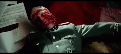
The marshal Teddy kept having what looked like flash backs throughout the film that tended to be very dramatic. I thought that this makeup look in the image above was extremely unrealistic which made me lose some of the emotion I was feeling towards the film. I think the blood looked far too red all over and it didn't have enough dimension, so just looked plastic and fake looking. This is a big lesson to why you should always make your work as realistic as possible because otherwise people stop believing and can lose interest.
 |
| Screenshot of Shutter Island (2010). |
After Teddy had the awful dream about helping Rachel drown her children it was clear he woke up because the same bright lights happened than when he woke up last time; however then his dead wife entered the room which threw me off because I knew she was dead which meant Teddy must still be in a dream. I liked this because it made me ask so many questions the editing didn't necessarily reflect what was happening in the scene accurately as it could be used to confuse you. This then made me question if the next time he supposedly woke up was actually still a dream. This inspired me to include a possibly plot twist or something that will throw the audience off track because they will then start to question things and look into things more closely.
 |
| Screenshot of Shutter Island (2010). |
Hallucinations of Teddy's dead wife and young girl that he killed keep appearing throughout the film telling him not to do certain things; however after speaking to the 'real' Rachel, this is the first scene where he clearly fights back. He wants to blow up a car to distract the asylum guards, even though his imaginary wife is pleading for him not to. He runs and hides behind a tree to watch the explosion but his wife and the young girl walk and stand in front of it which is very clever because they are clearly just in his imagination but you can still the thought of blowing them up is painful to him. It made me feel sympathy towards Teddy because I could see how hard it was for him to watch this happen, but I was really hoping that he wouldn't fall for this trap. I like how emotional involved I was to this scene and I will hopefully create the same emotion in my own fashion film.
Edits/Camera Techniques
 |
| Screenshot of Shutter Island (2010). |
After Teddy takes some pills given to him by the doctor for his apparent migraines, he has a very disjointed, confusing dream. I thought the editing was very clever because many different people keep appearing in the same room who want to talk to him. This is very confusing for the viewer because it isn't clear whether he is hallucinating from the drugs or whether this is a dream. I found it disturbing when he revisits where all the dead bodies were because in one clip all the bodies were dead, then the next the woman had opened her eyes and then the next the child opens her eyes and starts to move. The camera kept flicking on and off the 'dead' people which I liked because then it was a shock when they were next shown looking different. The young girl then slowly sits up and says, "You should've saved me. You should've saved all of us" which suggests Teddy feels extremely guilty for being involved in the shootings and regrets not trying to save them. This is very creepy as we know that the girl is really dead, yet she is now sitting up and talking to him. The next encounter was Laeddis who was slowly revealed surrounded by fire; I thought this was effective because it
clearly represented that he had burnt his wife to death. The edits are very long in this scene, possibly to show Teddy was trying to digest all the information, but maybe to build tension as the audience thinks something bad might suddenly happen. The low edits in this scene could also reflect how Teddy is moving very cautiously around Laeddis so he doesn't aggravate him to lash out.
 |
| Screenshot of Shutter Island (2010). |
The camera focusing just on Teddy's face and then returns to what you think it going to be Laeddis but it turns out to be Chuck, his assistant. I think this is effective because it reminds the viewer that this is Teddy's dream so anything is possible. This adds a sense of calm because the viewer knows who Chuck is and knows that he is Teddy's friend, however this calm instantly stops when there is a loud scream. When Teddy hears the scream he quickly looks to the side to see who it is and the editing suddenly speeds up, possibly to reflect his panic and shock. There is a zoomed out clip where there is only Teddy in the room, meaning that both Laeddis and Chuck has vanished into thin air. The camera quickly turns to Rachel who is covered in blood, which was very shocking, especially because she looked so calm with a slight smile on her face which is not how you'd expect someone who has just screamed to look like. I found this very creepy and tense because you weren't sure how she would react to any movement of Teddy's and if she'd suddenly lash out at him. She smiles and politely asks him to help so when the camera moves down to her feet and shows her dead, bloody children it is very shocking and disturbing. This could represent Teddy dreaming about Rachel and her children she killed and how she clearly has no remorse for their death. It is shocking when Teddy leans over and picked one of the dead children up because he knows that helping Rachel is the wrong thing to do; this caused tension and anxiety as I didn't know what his or Rachel's intentions were. Threatening music starts to play when he lifts her up which instantly made me feel uneasy because it reflected that something bad was about to happen. The child that he picks up happens to look like the same child that he had shot amongst the rest of the dead bodies and she again started asking him why he didn't save her. This was very confusing because he was mixing two situations together in him dream, but it clearly meant something, most probably that he felt so much guilt.
 |
| Screenshot of Shutter Island (2010). |
I thought the scene in Teddy's dream where he helps Rachel place one of the dead children into the lake was very disturbing because I didn't know why he was helping her. I really like when there is a long edit of the young girl sinking into the water because the waves in the water almost make it look like she is trying to mouth some words to him, like she is still alive and sending him a message. I liked this because it set off so many questions in my head about what she could have been saying, possibly trying to warn him or threatening him.
 |
| Screenshot of Shutter Island (2010). |
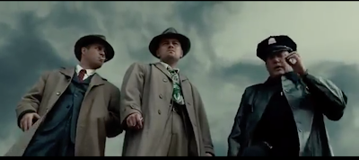
This is a classic angle used to make the actor look heroic and powerful. The camera is facing sharply up at all three men which makes them look bigger and therefore more dominant. I think this example is slightly too exaggerated because it looks very unnatural; however I would consider playing around with angles to make people look either powerful or vulnerable etc.
Lighthouse Scene
 |
| Screenshot of Shutter Island (2010). |
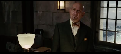
The scene where Teddy gets to the top of the light house seriously confused me and made me question everything! The doctor tells him that he has been living on the island for 24 months as a mental patient and that everything that he believes is true is just his fantasy world. When Teddy questioned why he was shaking the doctor said that it was from the drugs they had been giving him for the last 24 months and that he was having withdrawal symptoms. This scene really made me reconsider everything that had happened previously. Even though I, as a viewer, had followed the storyline through Teddy's eyes and had believed everything that he said, I now began to question if this was just how he viewed it, instead of it being a reality. Could this whole storyline have been one big hallucination? I was convinced that everything Teddy said was true, especially because when he spoke to the 'real' Rachel everything she said made sense. I didn't know whether to stay true to Teddy and hope that he doesn't get sucked into these lies the doctor is telling him or whether to just except that everything had been a lie and he truly has been a patient for 2 years. But if the doctor was lying and making all this up then how would he know what Teddy dreamt about? This scene was very fun and exciting to watch because so many different possibilities were going through my mind about what was reality and what was made up.
Last Scene
 |
| Screenshot of Shutter Island (2010). |
The final scene confused me again because I had accepted at this point that Teddy was actually called Andrew and he was a mental patient who had lived on the island for 2 years; however I felt I could have interpreted the final scene in many different ways. I thought that either Andrew was having a laugh with Chuck and new that he was really a mental patient but was just referring to the jokes they had when they were marshals in his head; however this didn't add up because Chuck referred to him as Teddy and I didn't get the impression he was trying to be funny. I think either Andrew had already deteriorated and thinks he is living in his imaginary world again, or they are both still marshals in reality and the joke is on the doctors who think they are going along with their plan. I love how this film is left on a cliff hanger and how even though you were convinced that certain things were real, you still question everything even at the end. I like it because it will make you think of the film and discuss it, carrying on the interest in the film even after you're watched it.
References:
Shutter Island, 2010[film]. Directed by Martin Scorsese. USA: Paramount Home Entertainment
IMDB, 2017. Shutter Island (2010) [viewed 20rd January 2017]. Available from: http://gb.imdb.com/title/tt1130884/


